~or~
Blurbs? How hard can it be… right?
The back cover blurb may be the three most important paragraphs to whoever picks up your print edition. In those 150-175 words, your potential readers may decide if they are going to become actual readers. And even if you are published in eBook formats only, the ever present description box needs the blurb to accomplish the same thing.
You might let your literary agent do it, or your publisher. But it is your book. Want to give it a go? (If you are self publishing, you will have to.) Now there are places online where you can get good tips for writing a blurb. I just want to highlight a few as I see them.
First, keep it lean and to the point. Do you have an ensemble cast? There is not a lot of room for, “Meanwhile, back on Tau Ceti 5, the brother-in-law discovers…” Focus on your protagonist and keep the description to their key arc. That is really what your book is about, isn’t it? The rest of the supporting content is good, but belongs in the book interior.
Also, I recommend a classic format. Introduce your protagonist in paragraph one. Are they relatable? Even the most way out character has something to which a reader can relate. Paragraph two sets up your conflict. It upsets you lead’s world and often starts with an action word. And finally, the third paragraph is the big tease. You’ve set up your protagonist and the conflict, now hint at the journey, the stakes, and the awesome forces at odds. But do not give away too much.
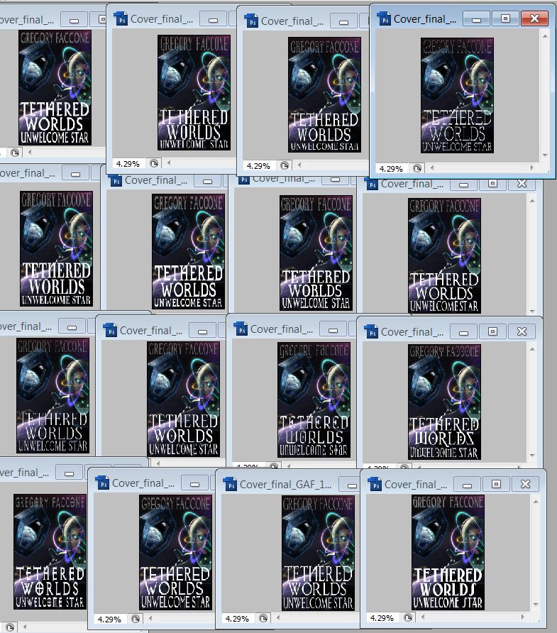
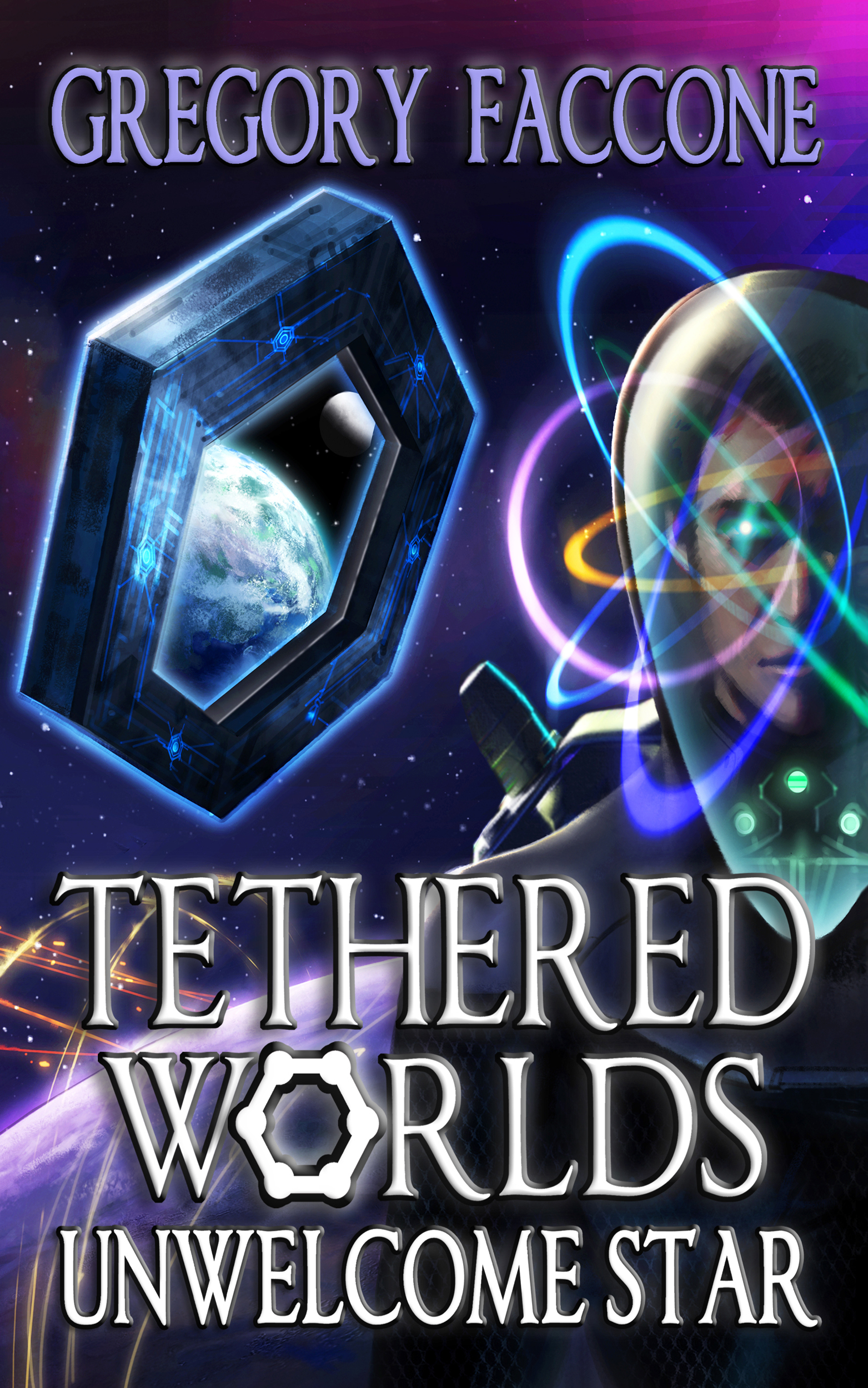
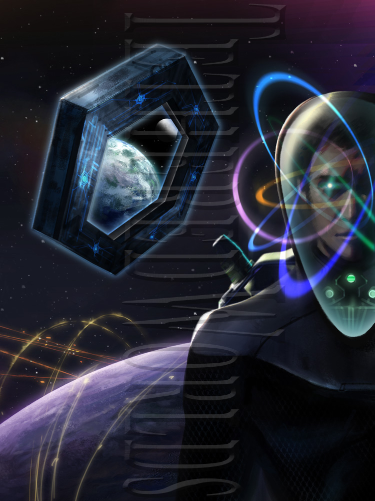
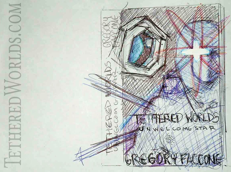
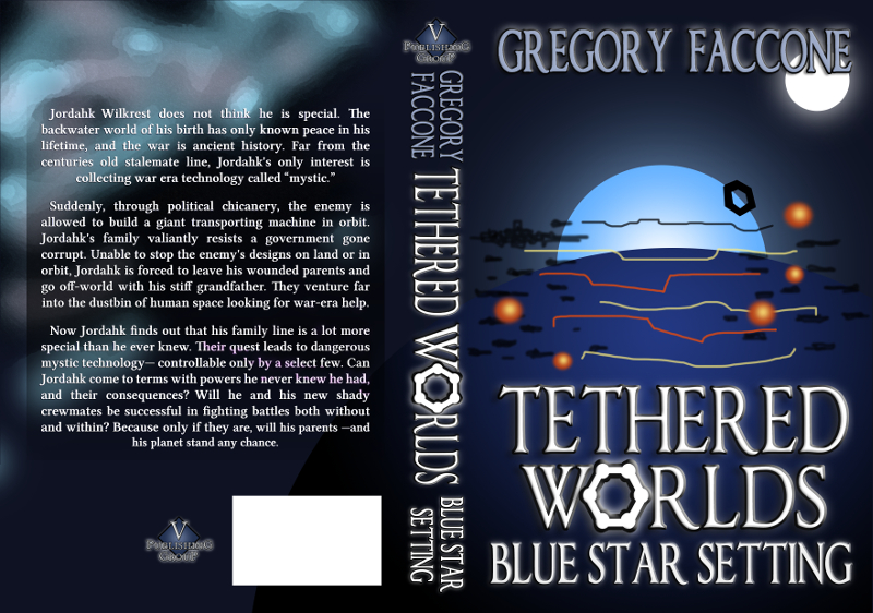
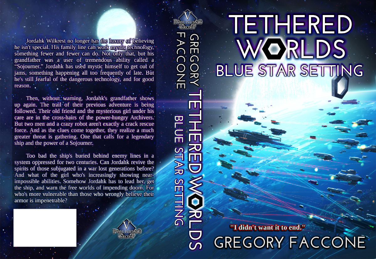
And lastly, some practical advice. Have you paid a professional artist to make your cover art? Your blurb and that art need to coexist. Make sure your text is not tiny, is easy to read, and not some crazy font that gives customers headaches. I decided to not obscure my fine cover art with an opaque text box. I wanted it to blend in organically, and even have some color and life to it. So many little things go into a professional book. You know this if you are doing it all yourself. Whether you are or not, it is YOUR book. Make sure all the ingredients comprising your fine creation are the best they can be.
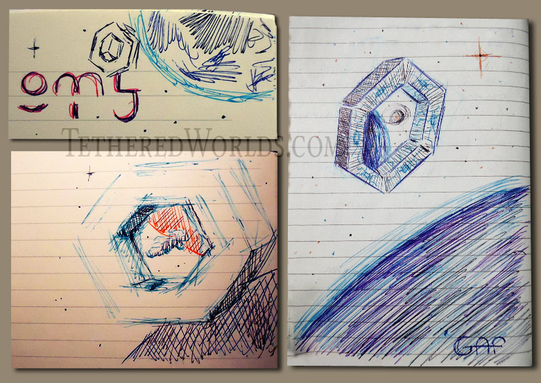
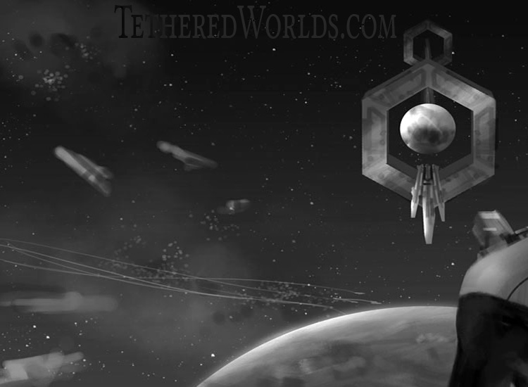
*Relocated content originally posted at TetheredWorlds.com.▪ ▪ ▪
Tethered Worlds is a series full of color. It may even have some practical advice on life, relationships, and destroying robots. The time spent reading it may inspire you to overcome your daily challenges.
You can also check out Lorenz’s site and see his interesting work.
The Book Cover Series:
Done Last – But Seen First
Don’t Trip Running the Bases
Titles are Only Catchy if Comprehensible
Making a Superb Back Cover Blurb