Sci-Fi Book Series Should Share More Than a Font

~or~

“Tether” your novels.

A series should be connected by more than characters and title. A series book bears responsibility beyond what’s necessary for its standalone plot, it owes allegiance to a greater whole. The first job of the first book is the obvious one. Launch the reader to a new universe.

"Yay! We lived through the first movie. We get to come back!"
“Yay! We lived through the first movie. We get to come back!”

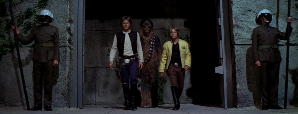
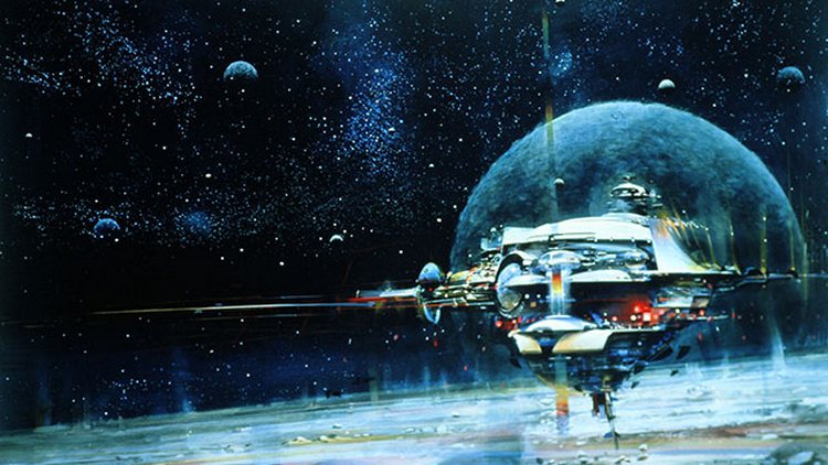
Consider the Star Wars that started it all, A New Hope in 1977. It executed a wonderful standalone story while at the same time introducing us all to Empire versus Rebels, Luke Skywalker, and a gizmo called a light saber. It laid the foundation upon which even the prequels were built.

A truly connected series does another import thing, it plants seeds for future entries. This doesn’t take away from the single book plot carried and concluded between the covers, but rather speaks to a greater mission. Content whose full consequence will not bloom until a future book. It makes for an even greater payoff, although there’s also immediate benefit in letting the reader know more is yet to unfold.

Harry Potter: "Oh Hedwig, at least you will be by my side for the entire series."
Harry Potter: “Oh Hedwig, at least you’ll be by my side the entire series.”

The first Harry Potter book, much like the first Tethered Worlds novel, does a fine job introducing the reader into a whole culture. These books teach you their unique terms. From wands and gristers, to quidditch and threshes. But they do more. They plant seeds for the future, teasing at content that serves double duty for current and future book.

It was once pointed out to me that some content I wrote was not strictly necessary to the current story, but I knew it was there for a fun, future payoff. A reviewer who really understands this concept is DED over at The New Podler Reviews. Check out his take on Tethered Worlds Book Two: Blue Star Setting and then jump into a great adventure.

Keir Dullea as Dave Bowman in Arthur C. Clarke's 200:1 A Space Odyssey. "I'm not worried, it's not like they'll ever make a sequel to this...right?"
Keir Dullea as Dave Bowman in Arthur C. Clarke’s 200:1 A Space Odyssey. “I’m not worried, it’s not like they’ll ever make a sequel to this…right?”

_____________________________

Tethered Worlds_banner_v8

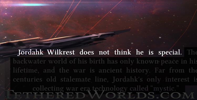
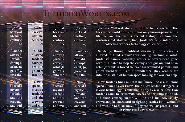
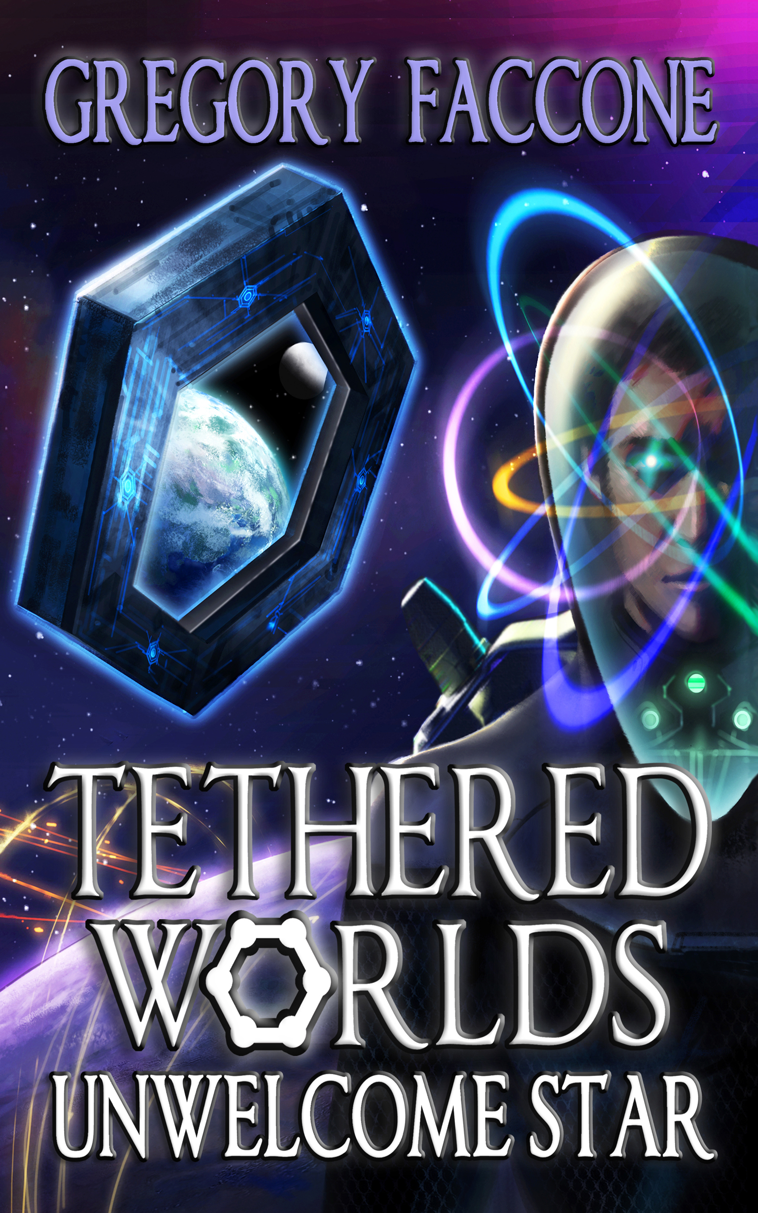
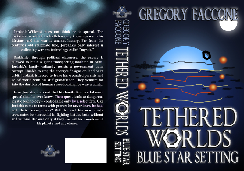
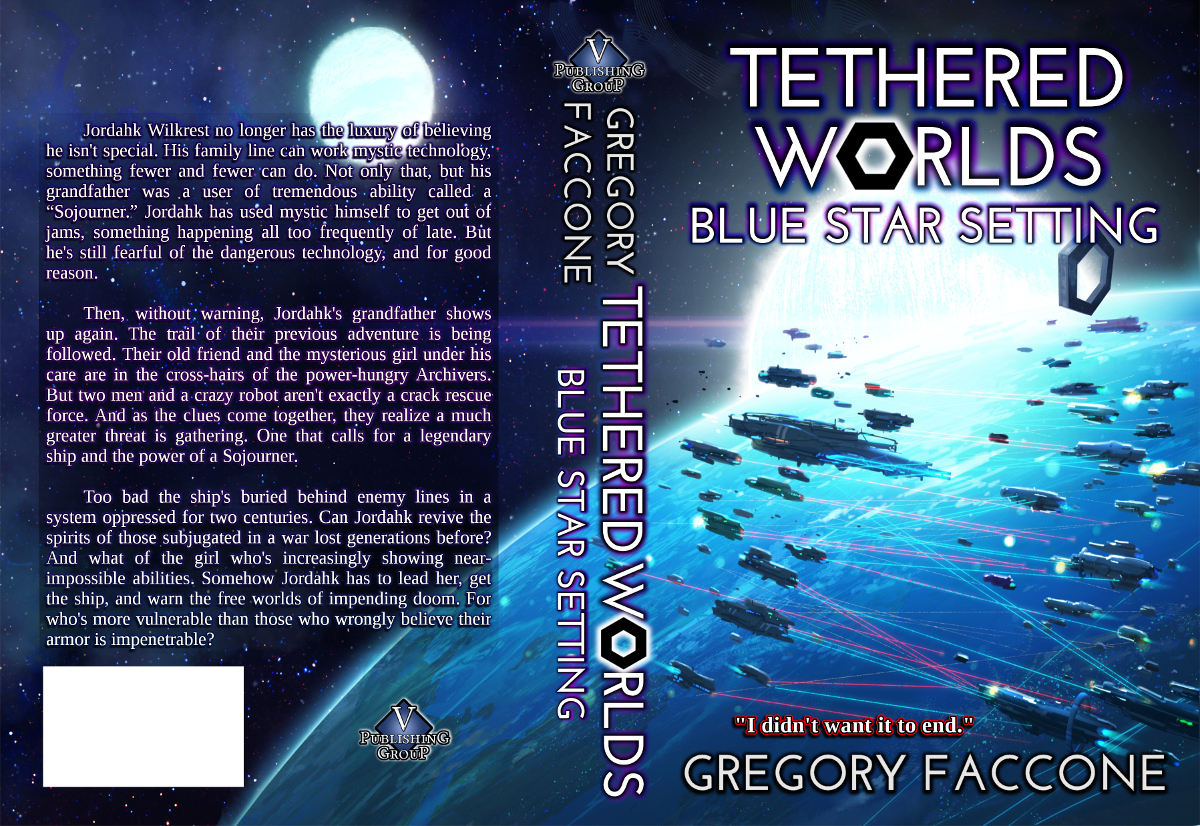
Tethered Worlds: Unwelcome Star launches you into a multi-book adventure. See for yourself who your favorite characters are and hold out hope for them. A journey, begun in Unwelcome Star, continues (hopefully for your favorite) in Blue Star Setting.

Tethered Worlds Book One Thanksgiving Weekend Sale — Done & Thanks!

 POST SALE UPDATE: We are grateful to those who helped support our sale. To all who purchased, thank you and happy reading. We hope you enjoy the series, and if you do, let us know!

UNWELCOME STAR For $0.99—Thanksgiving Weekend Only!

Berkey_Space_Station_750

We are running this special for four days, November 27-30. The Tethered Worlds series has been well received. Now you can start from the beginning with the Kindle edition of book one, Unwelcome Star, for only $0.99.

Tether Worlds Unwelcome Star (kindle edition) at Amazon

Be there with Jordahk as he is thrust into a quest to save his world—and find out more about himself. Glean hints from Jordahk’s mysterious grandfather who knows more than he’s willing to say. Watch the whole family square off against a cunning fleet commander and a ruthless technology hunter.

Check out our newly released trailer and then go on an adventure!

_________________________________________

space_invaders_signatureGregory Faccone hopes you will also check out the Tethered Worlds series. It may not make colorful fractals leap off the page, but they still can in your mind!

Book Covers IV: Making a Superb Back Cover Blurb

~or~

Blurbs? How hard can it be… right?

The back cover blurb may be the three most important paragraphs to whoever picks up your print edition. In those 150-175 words, your potential readers may decide if they are going to become actual readers. And even if you are published in eBook formats only, the ever present description box needs the blurb to accomplish the same thing.

You might let your literary agent do it, or your publisher. But it is your book. Want to give it a go? (If you are self publishing, you will have to.) Now there are places online where you can get good tips for writing a blurb. I just want to highlight a few as I see them.

Tethered_Worlds_Unwelcome_Star_back_cover_blurb_opening_750

First, keep it lean and to the point. Do you have an ensemble cast? There is not a lot of room for, “Meanwhile, back on Tau Ceti 5, the brother-in-law discovers…” Focus on your protagonist and keep the description to their key arc. That is really what your book is about, isn’t it? The rest of the supporting content is good, but belongs in the book interior.

Also, I recommend a classic format. Introduce your protagonist in paragraph one. Are they relatable? Even the most way out character has something to which a reader can relate. Paragraph two sets up your conflict. It upsets you lead’s world and often starts with an action word. And finally, the third paragraph is the big tease. You’ve set up your protagonist and the conflict, now hint at the journey, the stakes, and the awesome forces at odds. But do not give away too much.

Keeping it real (readable). I wanted a little color and flavor on the back cover blurb letters. Not just plain white. But readability had to come first. In the end the dark background frame worked well, fading out before the ships.

And lastly, some practical advice. Have you paid a professional artist to make your cover art? Your blurb and that art need to coexist. Make sure your text is not tiny, is easy to read, and not some crazy font that gives customers headaches. I decided to not obscure my fine cover art with an opaque text box. I wanted it to blend in organically, and even have some color and life to it. So many little things go into a professional book. You know this if you are doing it all yourself. Whether you are or not, it is YOUR book. Make sure all the ingredients comprising your fine creation are the best they can be.

*Relocated content originally posted at TetheredWorlds.com.

▪ ▪ ▪

Tethered Worlds is a series full of color. It may even have some practical advice on life, relationships, and destroying robots. The time spent reading it may inspire you to overcome your daily challenges.

You can also check out Lorenz’s site and see his interesting work.

The Book Cover Series:

Done Last – But Seen First

Don’t Trip Running the Bases

Titles are Only Catchy if Comprehensible

Making a Superb Back Cover Blurb


Book Covers III: Titles are Only Catchy if Comprehensible

~or~

Reading is Fundamental

This is the third and final post on creating an excellent book cover. The first post discussed refining your vision to keep it clear and simple. The second talked about bringing that refined vision to reality with a contract artist. This third is about the all important titling. Now I am not talking about the actual words you use, although that is important and worthy of its own post. Rather I am referring to the readability of the title.

That sound basic? You might be surprised at what a perusal of Amazon offerings reveals. Your book is going to first be seen in a 150 pixel thumbnail! That may make or break a potential reader’s interest right there. I will not embarrass any author’s book cover here, but it will not take you long to see a block of color and maybe a figure. At the bottom a series a squiggles hints at a title. Sometimes certain fonts drop right out of existence altogether at that reduction.

Legibility and font go hand in hand at any size. Note how seriously I took it with experiment after experiment. The spirit of a book can be honored with a distinct, but still readable choice. In my case, I eschewed overly "sci-fi" fonts for a classic Roman-esque which fit an undertone of the book.
Legibility and font go hand in hand at any size. Note how seriously I took it with experiment after experiment. The spirit of a book can be honored with a distinct, but still readable choice. In my case, I eschewed overly “sci-fi” fonts for a classic Roman-esque which fit an undertone of the book.

Now you have determined a sufficiently large font size for your book title. You have left appropriate space in your cover for it. (You did leave space, right? Do not cover your protagonist’s face!) What about font choice? Beware the dark side here. Avoid the temptation and the pitfall of overly stylized fonts. You know the kind. Some are so sci-fi that you spend a minute just trying to figure out what it is supposed to say. Fail. Such fonts can easily be cliche or dated; both messages will not serve you well.

Classics are classics for a reason. Use them to your advantage. Consider book interiors. 90% of them are Times New Roman or something similar. “Hundreds of years of book tradition” (as one online expert put it) make for a difficult trend to buck. Find your individualism someplace else. I am not saying be boring on your book cover. No way. But there are a lot of interesting and pretty things you can do to a readable font. I consulted my own local font expert for some tips as I navigated and polished my title presentation.

Here is the (re-worked update of the) final front cover. Legibility does not preclude fun bevels and subtle glows. And of course, adding unique touches like an iconic symbol from the series makes it all the better, memorable, and identifiable.

Make sure (to avoid headaches) you have your exact pixel size and proportional dimensions accurately nailed down. I had a minor issue with the ratio which I did not discover until after the font work was more-or-less done. Thank goodness again for leaving all the elements in layers. I had the extra room to widen because the original art is suitably large for the coming print edition. I also had each word and even the symbol ready to be scaled and nudged individually as needed.

As I have found out on this journey, a book is comprised of so many elements. The writing is the bulk of it, but all these supporting factors play a part. How many car choices come down to finish and color? Both cars in question may be quality vehicles, but the exterior of one grabs the attention and compels a second look. Make sure you do justice to your months or even years of writing by investing the appropriate final portion of effort. Do not leave your cover in jeans when black tie is called for.

*Relocated content originally posted at TetheredWorlds.com.

▪ ▪ ▪

Tethered Worlds is a well dressed story that never goes out of style. Put on your spacesuit and join an adventure. The time spent may inspire you to tailor other aspects of your life to exactly fit your daily challenges.

You can also check out Lorenz’s site and see his interesting work.

The Book Cover Series:

Done Last – But Seen First

Don’t Trip Running the Bases

Titles are Only Catchy if Comprehensible

Making a Superb Back Cover Blurb


Book Covers II: Don’t Trip Running the Bases

~or~

Put Some Finish on Your Finish

There are book covers out there that would make your brows seriously rise in skepticism. You might think, and rightly so, that some authors just phoned it in. (Perhaps using the “generate cover” button available on some programs.) How can one work so hard and so long on a written piece and then approach its cover so lackadaisically?

As noted in my previous post on this topic, Book Covers: Done Last – But Seen First, a good novel can overcome its cover. But it should not have to! If you have thought through the basics, and you know what will serve your novel, it’s time to take it to the next level. If you have hired a professional, work with them and make the second revision better than the first. You are the customer. You are paying. (Even if you have hired your cousin and are paying with a dinner at Applebee’s.)

I consulted with one of my test readers. We examined covers to see what caught the eye. It led to my inclusion of a close shot of the protagonist. This was the sketch I sent my artist.

I wanted a slightly rough, painterly style. My artist had demonstrated it already, and his first take from my written descriptions was on the right track. Now we strived to make it even better. I sent him a sketch of how I envisioned it. He was influenced by that and the revised piece advanced even closer to what I wanted. If you pick a pro, act like a pro. Engage in some healthy back and forth. You both may find new things that work better as you do.

But be wise, and pick your battles. Do not nit-pick over micro things you can adjust yourself. Time is money for your contracted artist. Do not squander professional goodwill. Ask for your image to be left in layers. This was of immense help to me in making final adjustments. It also was instrumental in fully utilizing pieces of the art for my various web presences. Additionally, after all the details I originally wanted were added, I made the wise decision to drop some for simplicity and clarity (see last post). This was an option facilitated with minimal trouble by the layers.

Lorenz's artwork after some final modifications.
Lorenz’s artwork after some final modifications.

In the next post, the final for the Unwelcome Star e-book version cover, I will discuss the last crucial elements. Font and readability.

*Relocated content originally posted at TetheredWorlds.com.

▪ ▪ ▪

Tethered Worlds takes place in a vast and complex universe. But that does not mean the cover has to be overly complex. Read this series and go along on an adventure. You may find that the time spent in it spills over into your real life daily challenges— and triumphs.

You can also check out Lorenz’s site and see his interesting work.

The Book Cover Series:

Done Last – But Seen First

Don’t Trip Running the Bases

Titles are Only Catchy if Comprehensible

Making a Superb Back Cover Blurb


Book Covers I: Done Last – But Seen First

~or~

Sometimes You Can Judge an Book by its Cover

One might meticulously craft a written piece, be it a novel in my case, or perhaps an important PowerPoint presentation. Yet, despite however good those words are, the first impression people will get is your book cover or first slide. There’s information out there regarding good book cover construction. I know, I looked. Here are a couple distilled points that resonated for my project.

First, you must win the war against complexity. Fight the urge to include every key item and/or character on your cover. Today, the majority of book buyers are not going to hold your book in their hand at a brick-and-mortar store. They are going to see a thumbnail at an e-retailer. Finely painted conflagrations of detail and layers of subtlety are probably not going to come across at that size. Simplicity sells. Help the viewer get one solid idea about your book at first glance.

Tethered_Worlds_early_cover_thumbs_Gregory_Faccone

For me, it started with doodles that crept onto pages of notes, or images that found themselves forming when I felt like sketching. An iconic image of the egress, the central piece of technology from the Tethered Worlds series. Its clean lines and planetary backdrop made for great imagery. Its simplicity also did not suck all the oxygen out of the cover, leaving room for one more element which I will cover in the next post. So communicate a clear, clean concept. It does not have to be completely understood, that is what the novel is for!

You will need to find someone who can bring your vision to reality, or you can do it yourself. Although I’m a professional artist, I decided I wanted a fresh, loose take on the cover I envisioned. I contracted a fine artist named Lorenz Hideyoshi Ruwwe. He started homing in on what I wanted from a detailed document I wrote which included examples of covers I thought good and subpar. I even included examples of his own work I wanted him to emulate style-wise.

The early roughs started coming in, and just from my document descriptions Lorenz starting getting the big picture.

A good novel or PowerPoint presentation may overcome a less than stellar cover or first slide. But why make your work jump that hurdle? Sure, some established authors need only put their name on the cover. But until then, novels are complex creations that need to be packaged in such a way that people will read them. So make sure all your work’s components are functioning well and pulling in the same direction. Don’t gloss over the small stuff. The cliché that “a chain is only as strong as its weakest link” IS a cliché because it is so often proven out.

*Relocated content originally posted at TetheredWorlds.com.

▪ ▪ ▪

Tethered Worlds is a series upon which I have spent many non-writing months just working out the details. Be they creating a universe rich enough to support a series, or working out optimal text formatting. Read it for yourself and find out if it inspires you to create something and see it through to the end.

You can also check out Lorenz’s site and see his interesting work.

The Book Cover Series:

Done Last – But Seen First

Don’t Trip Running the Bases

Titles are Only Catchy if Comprehensible

Making a Superb Back Cover Blurb

Tethered Worlds Series Trailer Released

We just finished cutting the new Tethered Worlds series trailer. It is a fun, colorful, fractal filled experience! You will see some production art included. We also added tags for the first two books currently available in the series.

Book trailers are a relatively new phenomenon, but can be an entertaining and fast way to give people an insight into a novel. They transform the gist from a written piece of work into another medium well suited to the internet. Watch it full-screen and enjoy!

Tethered Worlds: New Covers for the Release of Book II

~or~

New! & Improved!

With the release of Tethered Worlds book two, Blue Star Setting, we have commissioned new covers for a new look to the series. We went classic for the introductory phase. Now that two books are out and the series is advancing in earnest, we decided on a more “techy” look. First, the redesigned Unwelcome Star cover:

Here is my rough layout for the new cover with the original classic font.
Here is my rough layout for the new cover using the original classic font.

You can see all the similar elements from the first edition cover, just rearranged. Again I called upon the fine artistic services of Lorenz Hideyoshi Ruwwe, who has painted all the Tethered Worlds covers up to now. I originally planned to have the spaceship coming through the hexagon on the first edition version, but could not get it to work well enough. This time we pulled it off.

Notice our new, fine-looking "techy" font. We retained the signature hexagonal egress replacing the "O" in "Worlds."
Notice our new, fine-looking “techy” font. We retained the signature hexagonal egress replacing the “O” in “Worlds.”

For the Blue Star Setting cover, I wanted to convey an epic space battle, and of course the blue star. Two massive fleets exchanging fire in a largely blue system, and with the hexagonal egress still nearby.

I thought the egress placement was best highlighted on the sun's edge. The white star is the second in this binary system. For the final, you will see it moved to the back cover.
I thought the egress placement was best highlighted on the sun’s edge. The white star is the second in this binary system. For the final, you will see it on the back cover.

We moved some of the elements around for the final, including the title and author text. Flexibility is a must when everything is jockeying for position on a book cover. Lorenz did a fine job making the egress angle dramatic.

One ship needed to be more massive than all the rest. (Those who had read the book know to whom it belongs.)
One ship needed to be more massive than all the rest. (Those who have read the book know to whom it belongs.)

We want the Tethered Worlds experience to be a quality one both inside and on the cover. Now that you have enjoyed the covers and the story behind them, consider reading the series and find out what this hexagonal thing in space is all about.

_______________________________

 space_invaders_signature

Gregory Faccone is author of the Tethered Worlds series, available at Amazon. He wants you to go on an adventure into space with his series. And honestly, it is a lot cheaper than trying to get to the international space station.

Test-Reader Feedback: Find the “11th Thing”

~or~

Not Only Sifting, But Some Baking Required

If you can spell, put two sentences together, and have enough patience, you too could write a book! But the real question is, “Is it anything anybody would want to read?” The road to that crucial answer may lead to the brave, the trusted, the select few you will choose to be test readers. Pick well, and with care, for the fate of your work may depend not on the feedback they give you, but on your interpretation of it.

This guy loves space. Now find two more test readers who don't.
This guy loves space. Now find two more test readers who don’t.

First, branch out and pick a reasonably diverse group. Diversity of opinion may not be found with three hard-core fans of the genre. Know their personalities, so that you can better expect and receive their feedback. Is one of them a nitpicker? Then don’t be surprised that they wanted a little more description of the space taxi on page 247. Is one of them very analytical? Be grateful that they brought to your attention that your space six-shooter shot seven times. Is one of them not even a fan of the genre? (Try to find one of those. They are a great asset.) Their feedback, properly enacted, may bust your book from niche to mainstream.

Say what? Yes, this paragraph is about pronunciations. Do your characters or places have any unique names? Perhaps you crafted unique spellings for conventional names. I have a whole section dedicated to this topic in my test reader feedback notes files. (You did write down and organize their feedback didn’t you?) You might be amazed how many different ways people who speak the same language pronounce a spelling you thought clear. I suggest engaging your test readers one at a time so that you can incorporate a new spelling if necessary and run it past them in succession. Some names I used took multiple passes to get just right.

The 11th thing. If you had 10 test readers, they would all give you different feedback. But your job is to figure out what they’re all trying to tell you in their own way. One may want to know the background of a certain character, another may want more information about that same character’s associations. Sure, address those details, but what are they both really trying to say? Is more clarity needed on that character’s whole side plot? What about that passage you were never able to get just right? Is the answer to fixing it eluding you? Surreptitiously solicit advice about it. Don’t let the cat out of the bag that you think it needs help. You want fresh, unbiased insights. Put together the puzzle pieces offered to you. Your test readers may have the missing key, with no idea of its value to your work.

Ideal_toy_space-helmet_fortiflex_600
“Houston, I’ve found a key.”

Finally, remember, putting your work out there for others to to critique can be hard. Take heart, there is the positive side. Chances are there was a scene you were a little unsure about. “Will my readers get it?” Perhaps there was a scene you never thought exceptional. Your test readers may surprise you with their praise. They may even put the pieces together in ways you never expected. That scene you labored upon, that you rewrote multiple times in a vacuum, may get unexpected, but thoroughly delightful validation. I know that was the case for me, and I hope it is for you too.

_____________________________

Tethered Worlds_banner_v8

Tethered Worlds: Unwelcome Star is a fun adventure, and one upon which you do not have to provide me with any feedback (but if you want to it would be nice). Go on your own test journey with these characters and experience with them challenges, victories, and an occasional dose of wisecracking humor. Read it for yourself and see which characters resonate with you.

The Catastrophe of Overly Curtailed Commas

~or~

Flowery Words: Too Much of a Good Thing?

2145261-william-shakespeare-in-period-clothing-talking-on-cell-phone

William Shakespeare is firmly ensconced in literary history, but his style of writing, while eloquent, is no longer common parlance. This is nothing against the master. But I think if Shakespeare returned to write tomorrow, he would have to adopt modern styles to be mass-market popular. In the same way we need to scrutinize our own writing.

It is very easy to get caught up in grandiloquent, overly ornamental descriptions. Ones which rely on the thesaurus (see previous sentence). Just because someone is bleeding, does not give us license to portray “the crimson flow…” While description is necessary, overly florid prose can call attention to itself and pluck a reader right out of the narrative. Just because you can write something classically pretty, does not mean you should. It can be hard at times to delete grand turns of phrase, but think of your novel’s greater good (and write poetry in your spare time).

Star_trek_opening_dialogue_kirk

What about use of punctuation? No, I’m not talking about how to use it (there are some online who feel quite strongly about that). Rather I am talking about the amount of punctuation. My research showed that punctuation is often overused by less polished writers. I edited on the fly Tethered Worlds to minimize extraneous ellipses, exclamation points, commas, hyphens, and dashes. The result was delicious soup– that needed a trifle more spice. I had over-done it. I spent another editing pass putting justified commas back in. It was amazing how the structure of many sentences became more clear just by knowing where to pause.

Ellipses, dashes, all the rest. There is a place for them. Though unseasoned authors can err with too much, freedom acted upon to use too little punctuation is also a mistake. It is said that popular authors can write any way they want. Certainly they have more leeway, but they also set the reading-culture tone with their lack of, or common use… of… ellipses. I put some of those back in as well, just because nothing else worked the same way.

The bottom line is that you must police yourself as an author. Take a good look at your prose, and if sonnets come to mind, consider taking it back a casual notch. Try to be objective when reading your paragraphs. If sentences mush together so that your mind cannot even take a breath, consider some punctuation. After all, as strong as bricks are, they find their strength and shared shape through the little bits of connecting concrete. Follow enough convention for clarity, and do not be afraid to find your own style with prose and punctuation.

_____________________________

Tethered Worlds_banner_v8

Tethered Worlds: Unwelcome Star depicts a universe where real people, contending with their own flaws, do not speak in sonnets. I assure you that you have much more in common with them than that. Read it for yourself and see which characters resonate with you.