~or~
Reading is Fundamental
This is the third and final post on creating an excellent book cover. The first post discussed refining your vision to keep it clear and simple. The second talked about bringing that refined vision to reality with a contract artist. This third is about the all important titling. Now I am not talking about the actual words you use, although that is important and worthy of its own post. Rather I am referring to the readability of the title.
That sound basic? You might be surprised at what a perusal of Amazon offerings reveals. Your book is going to first be seen in a 150 pixel thumbnail! That may make or break a potential reader’s interest right there. I will not embarrass any author’s book cover here, but it will not take you long to see a block of color and maybe a figure. At the bottom a series a squiggles hints at a title. Sometimes certain fonts drop right out of existence altogether at that reduction.
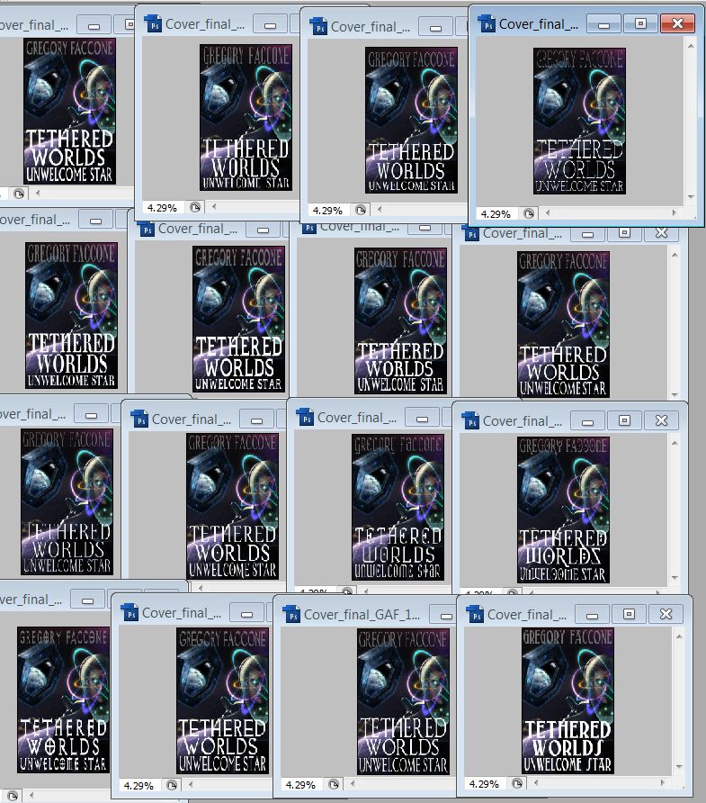
Now you have determined a sufficiently large font size for your book title. You have left appropriate space in your cover for it. (You did leave space, right? Do not cover your protagonist’s face!) What about font choice? Beware the dark side here. Avoid the temptation and the pitfall of overly stylized fonts. You know the kind. Some are so sci-fi that you spend a minute just trying to figure out what it is supposed to say. Fail. Such fonts can easily be cliche or dated; both messages will not serve you well.
Classics are classics for a reason. Use them to your advantage. Consider book interiors. 90% of them are Times New Roman or something similar. “Hundreds of years of book tradition” (as one online expert put it) make for a difficult trend to buck. Find your individualism someplace else. I am not saying be boring on your book cover. No way. But there are a lot of interesting and pretty things you can do to a readable font. I consulted my own local font expert for some tips as I navigated and polished my title presentation.
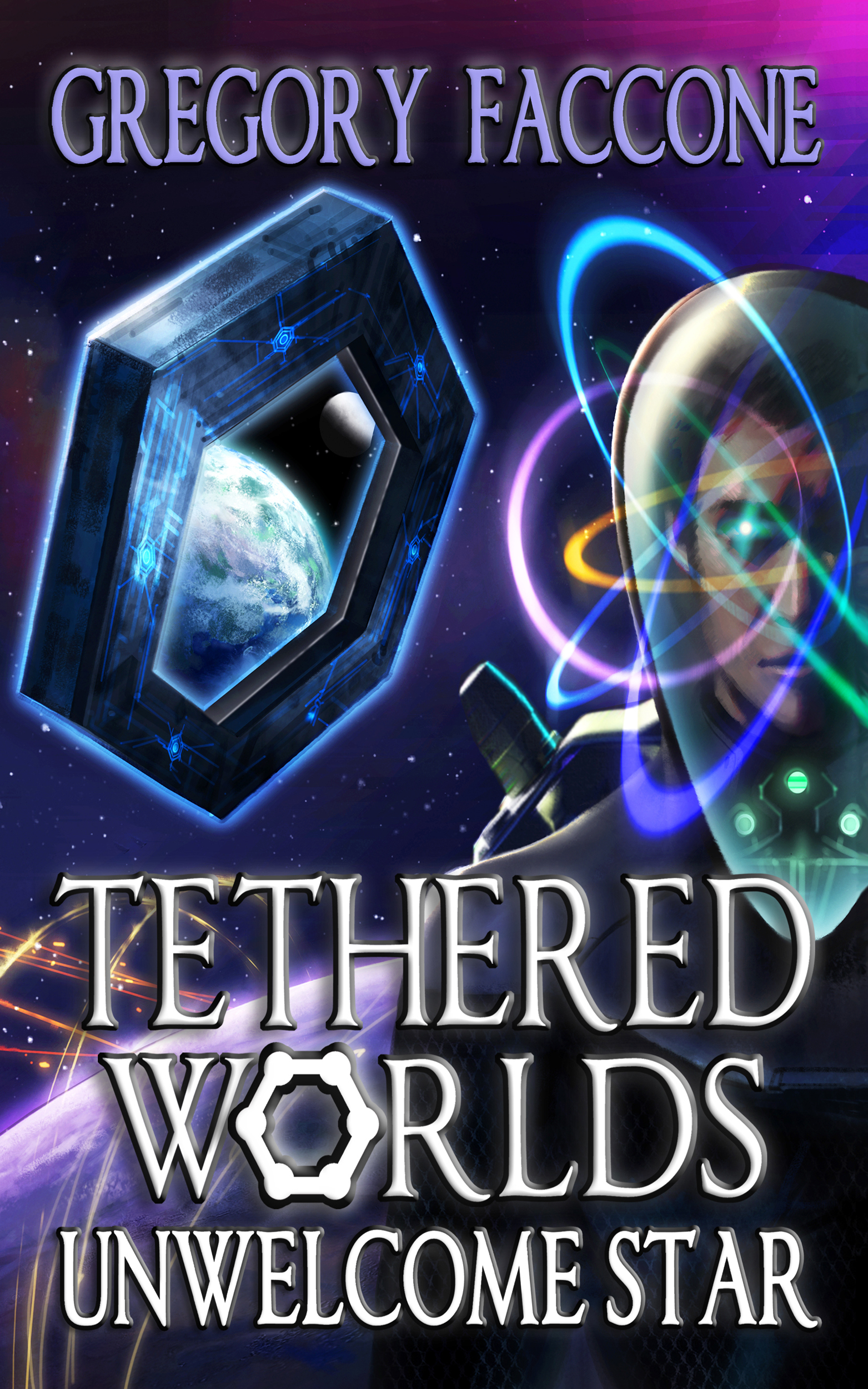
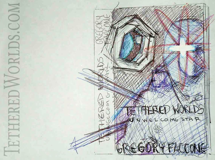
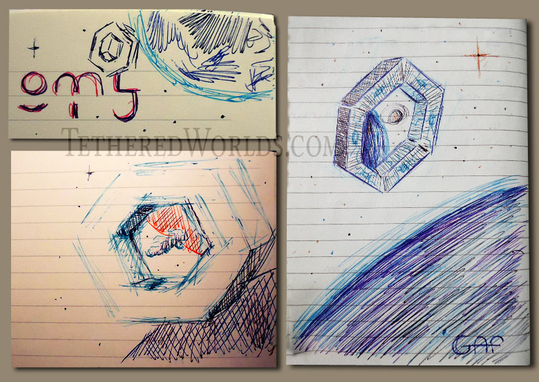
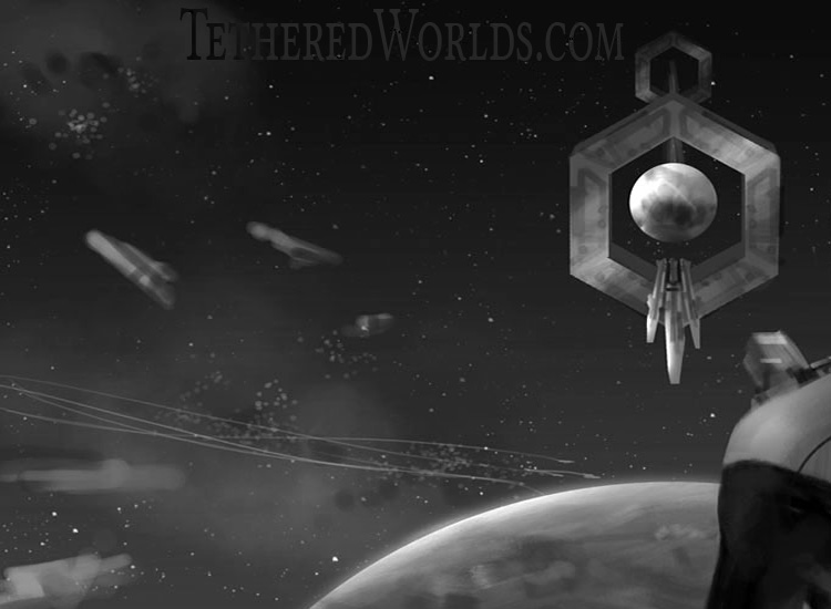
Make sure (to avoid headaches) you have your exact pixel size and proportional dimensions accurately nailed down. I had a minor issue with the ratio which I did not discover until after the font work was more-or-less done. Thank goodness again for leaving all the elements in layers. I had the extra room to widen because the original art is suitably large for the coming print edition. I also had each word and even the symbol ready to be scaled and nudged individually as needed.
As I have found out on this journey, a book is comprised of so many elements. The writing is the bulk of it, but all these supporting factors play a part. How many car choices come down to finish and color? Both cars in question may be quality vehicles, but the exterior of one grabs the attention and compels a second look. Make sure you do justice to your months or even years of writing by investing the appropriate final portion of effort. Do not leave your cover in jeans when black tie is called for.
*Relocated content originally posted at TetheredWorlds.com.▪ ▪ ▪
Tethered Worlds is a well dressed story that never goes out of style. Put on your spacesuit and join an adventure. The time spent may inspire you to tailor other aspects of your life to exactly fit your daily challenges.
You can also check out Lorenz’s site and see his interesting work.
The Book Cover Series:
Done Last – But Seen First
Don’t Trip Running the Bases
Titles are Only Catchy if Comprehensible
Making a Superb Back Cover Blurb